
2023 - Present
Interfaces
A sample of the interfaces I have designed, and in most cases what happened when I put them in front of people and measured the result.
I do not design in a vacuum and I try not to argue from taste. Each of these started with a specific failure in how people were already behaving, and ended with something I could test.
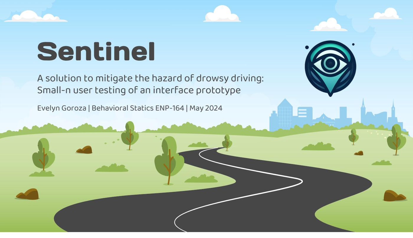
Sentinel
Interface design and comparative usability study, 2024
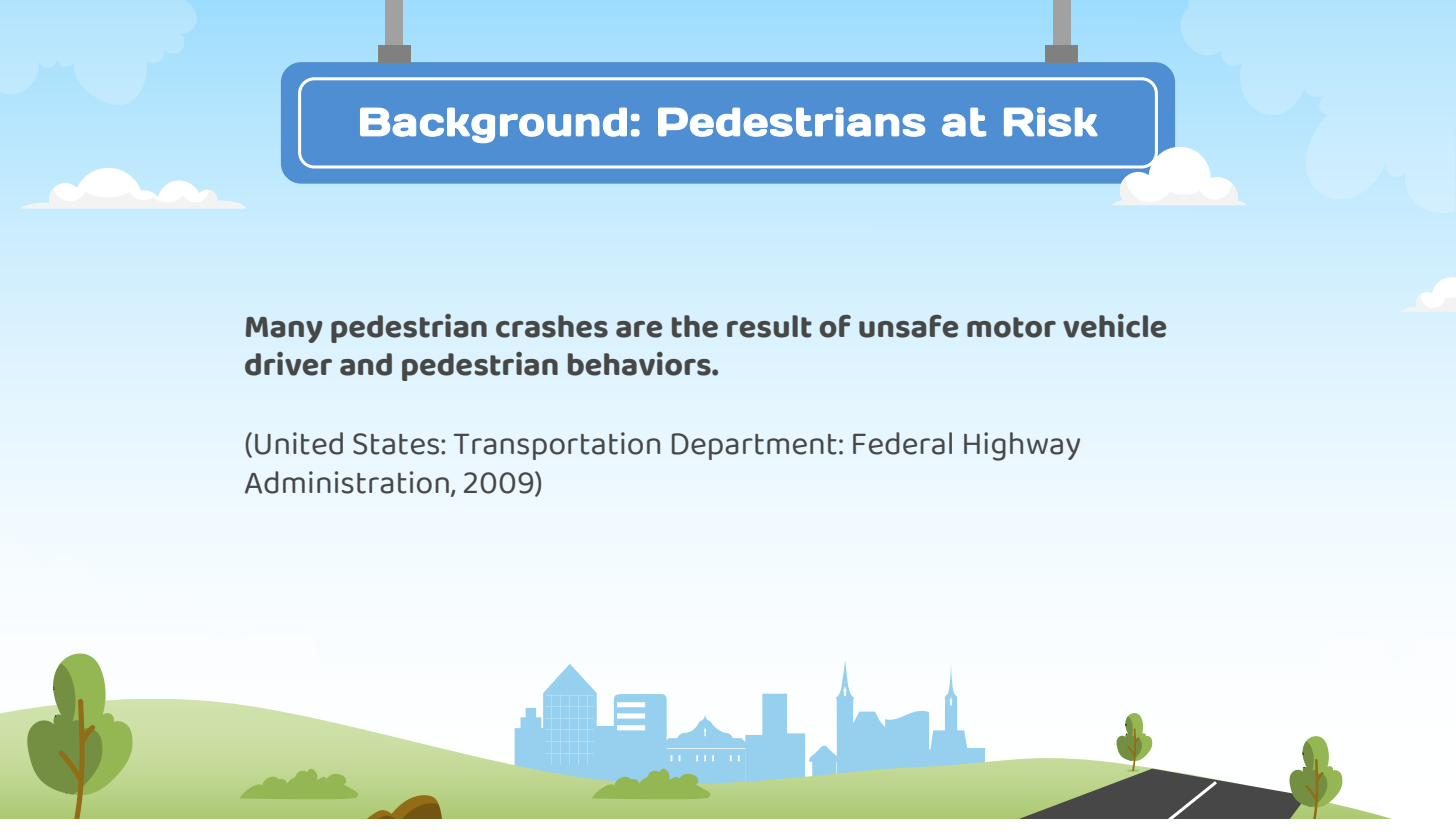
Drowsy driving causes roughly 72,000 crashes, 44,000 injuries, and 800 deaths a year in the United States. Apps that claim to catch it exist. They are also confusing, awkward to operate from a dashboard mount, and give you very little reason to trust them. I designed Sentinel to fix that, then tested it head to head against one that is actually on the market.
Three pillars drove every decision. Safety meant the interface had to read as reliable at a glance. Simplicity meant you could get through it from a phone mount while driving. Accessibility meant it had to work for people with sensory or perceptual differences. These were not values on a slide. They set the layout, the color, the type, and the interaction patterns.
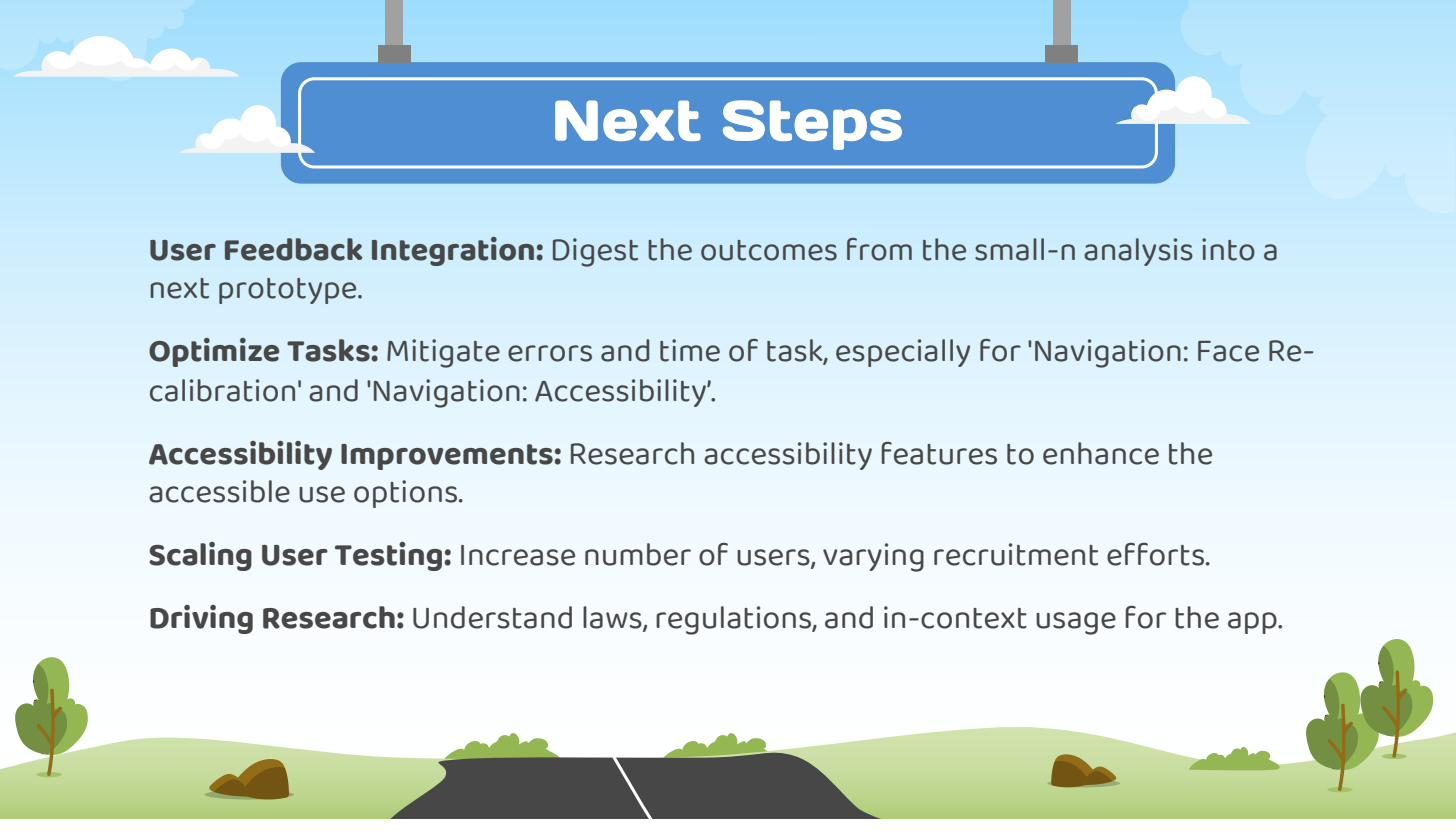
I ran the same five tasks on Sentinel and on Keep Alert: face positioning, alarm settings, privacy controls, face recalibration, and accessibility. I measured completion, time, errors, ease, and satisfaction. Sentinel scored significantly higher on perceived interface competency and on likelihood to recommend, both at p < 0.05. Ease of use came out comparable. The study also pointed straight at what I would fix next: recalibration and the accessibility flow.
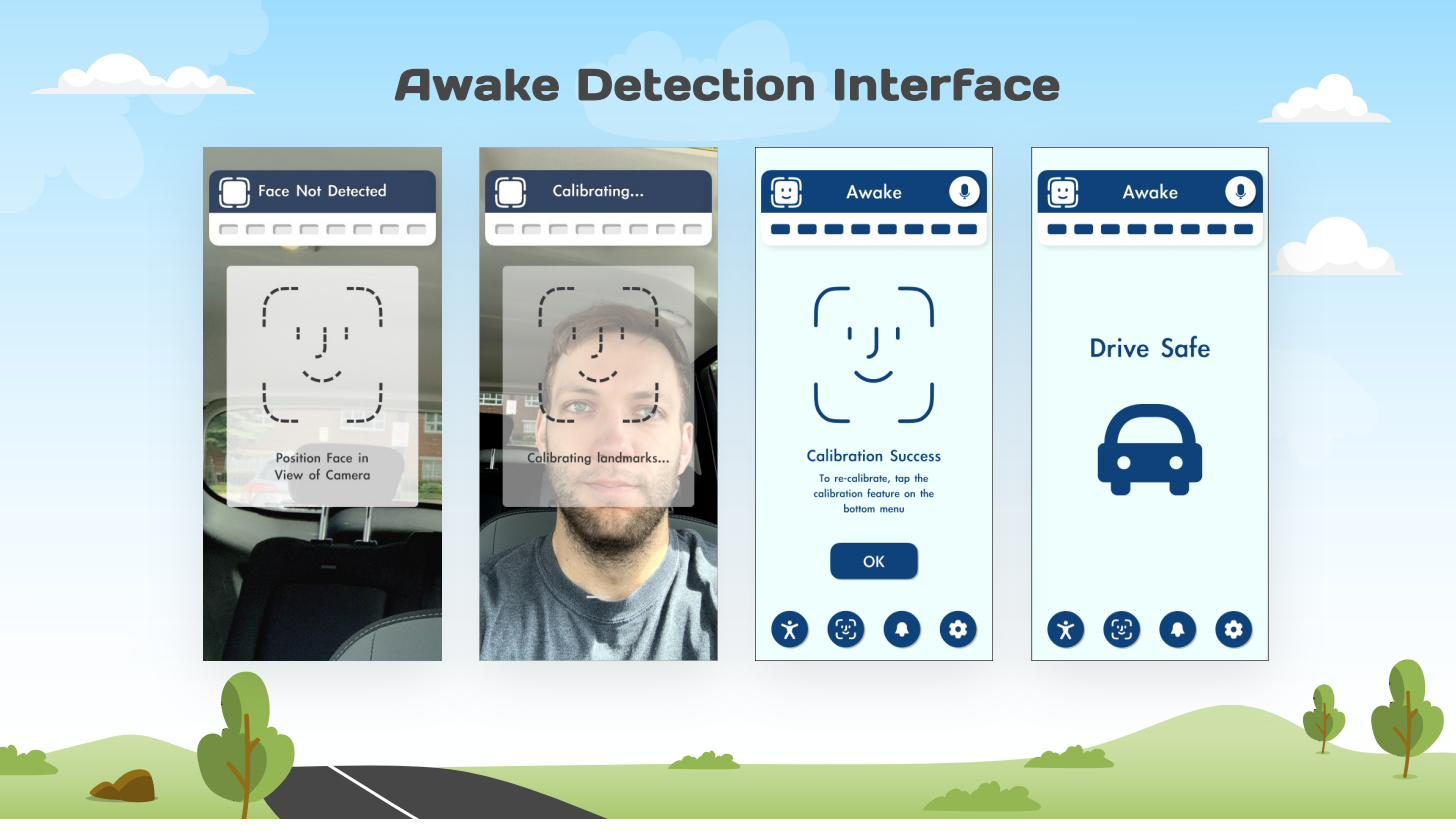
Preview only. Selected pages shown.
Up & Away Airlines
Interactive design
Nobody watches the safety briefing. It is passive, it is the same for everyone, and it asks nothing of you, so people retain almost none of it. The design question is not how to make it louder. It is how to make it something a passenger chooses to pay attention to.
I rebuilt it as a self-paced seatback experience in five segments: seatbelts, oxygen masks, life vests, brace positions, and exits. Each one uses step by step illustration and asks for an explicit confirmation before it moves on. The passenger sets the pace, which quietly turns watching into doing.
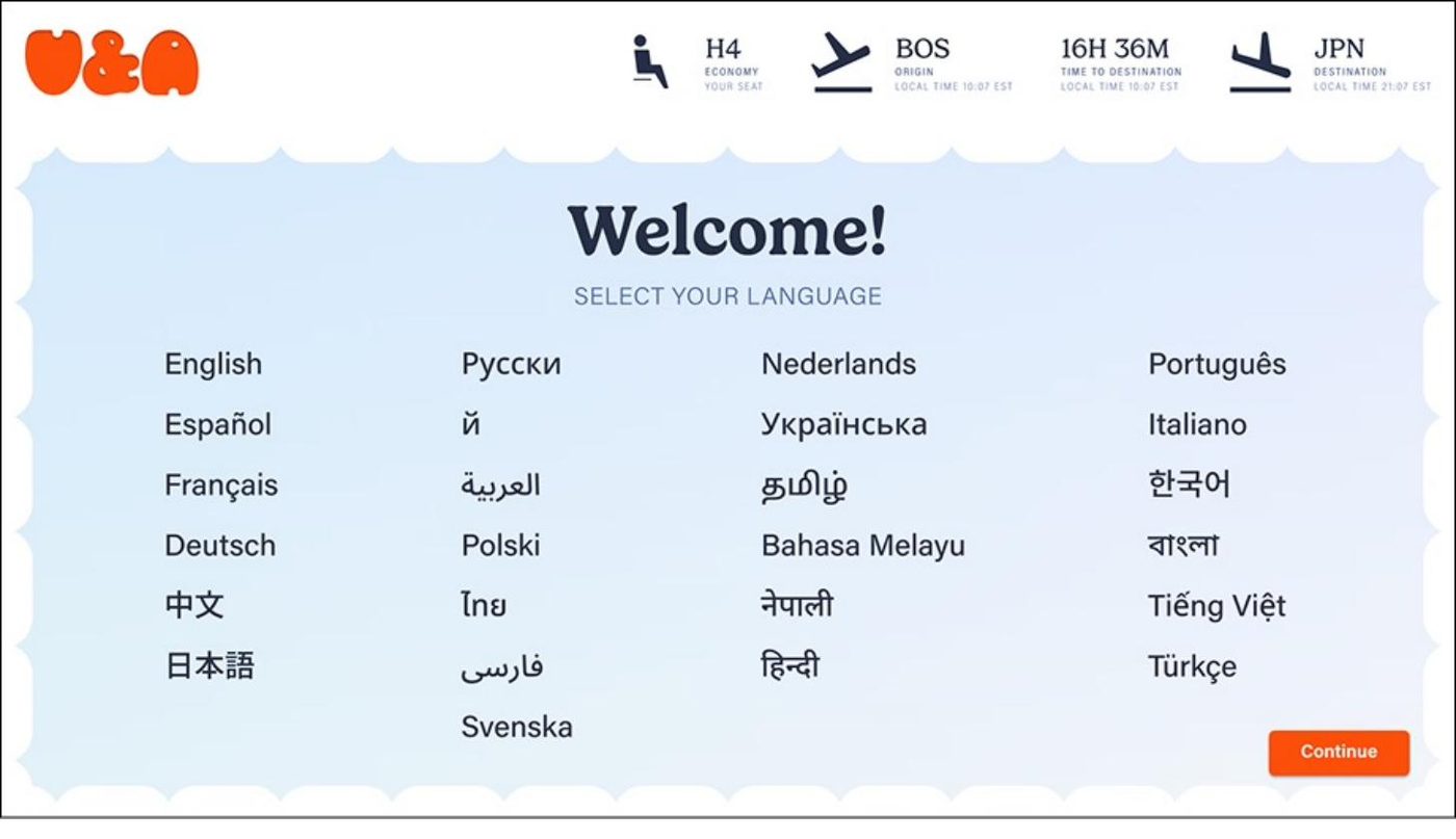
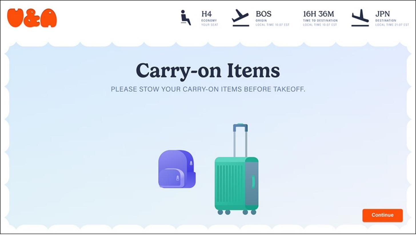

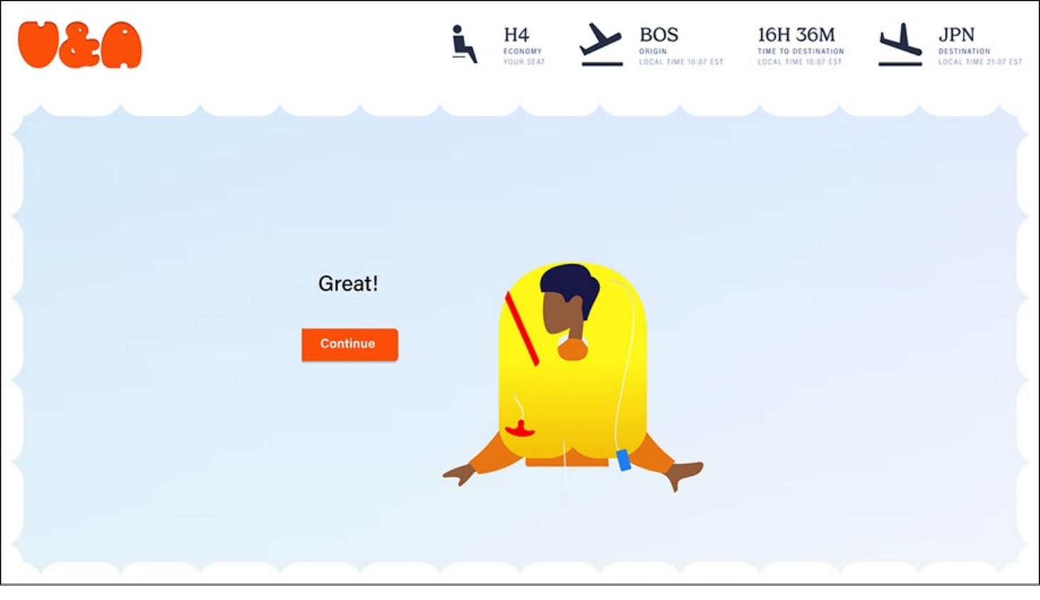
Preview only. Selected screens shown.
Off the screen
Environmental, industrial, and consumer research
Not everything I have designed is an interface. These three came out of the same habit: watch first, decide second.
SEC Atrium Redesign
The atrium is the front door to science and engineering at Tufts, and it was being asked to be a study hall, a cafe, and an event venue at once. After weeks of observation the pattern was obvious: people overwhelmingly came there to work alone, and the competing demands meant no single use was served well. The loudest complaint was also the simplest: nowhere near enough outlets.
I mapped the stakeholder groups and their conflicting priorities, interviewed people including a school administrator working through a parallel architectural redesign, and used SCAMPER prompts to break myself out of an early concept I had gotten attached to. Two designs came out of it. One uses modular stair-seating tables that retract for open-plan events. The other uses continuous T-shaped benches for semi-private work. Both put the outlets where observation said they needed to be. I built both at 1:30 scale in laser-cut plywood to judge the spatial tradeoffs in the hand rather than on a screen.
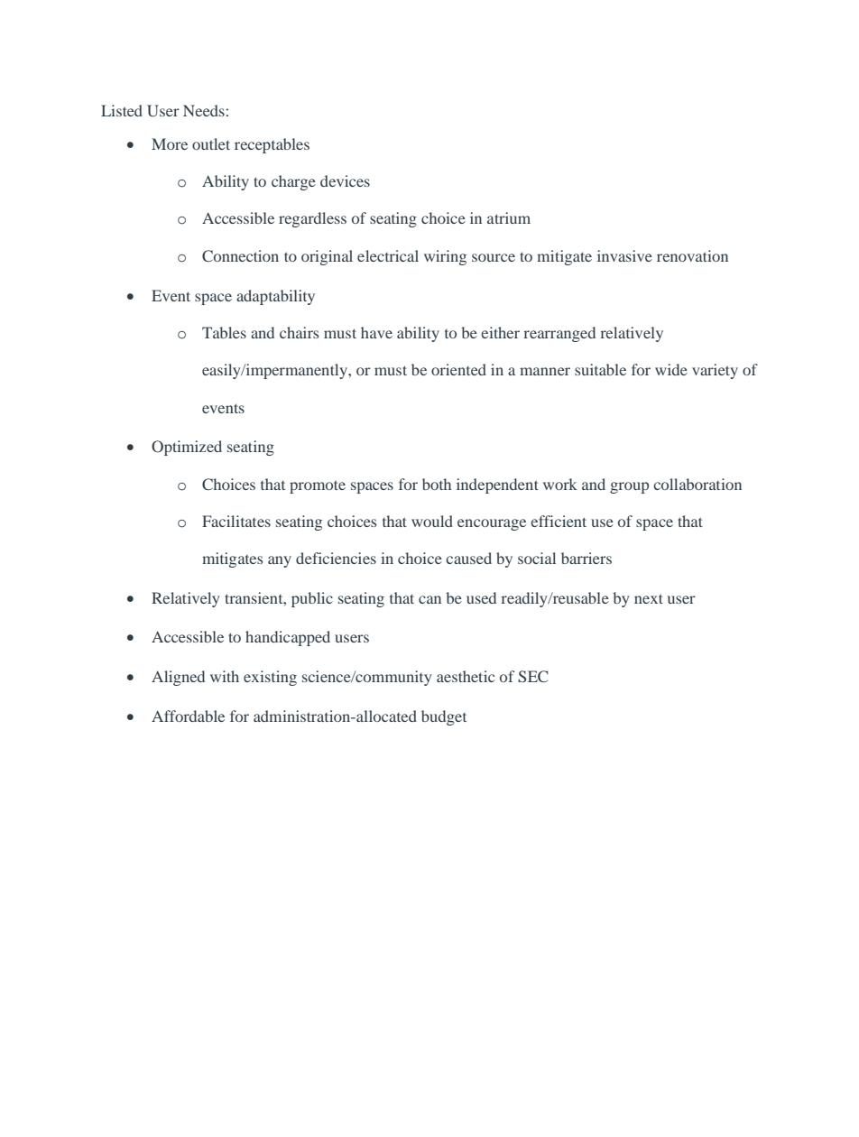
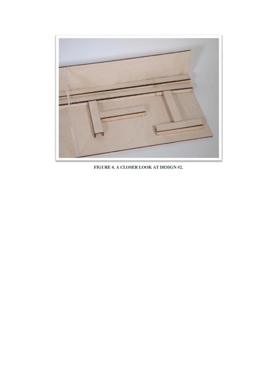
Preview only. Selected pages shown.
Eazy Daize
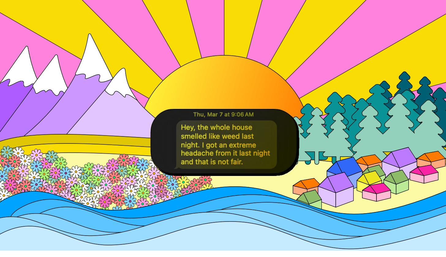
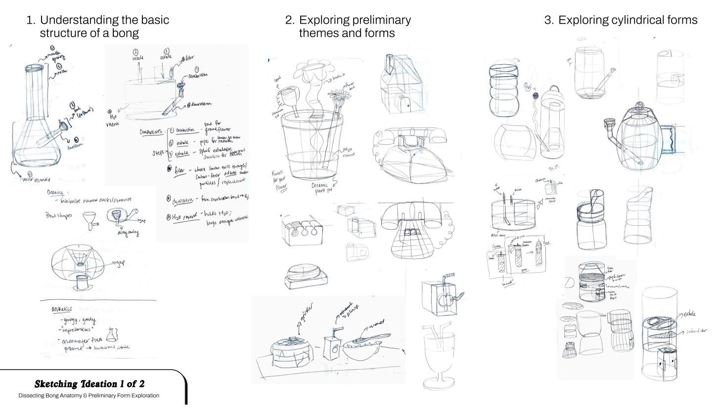
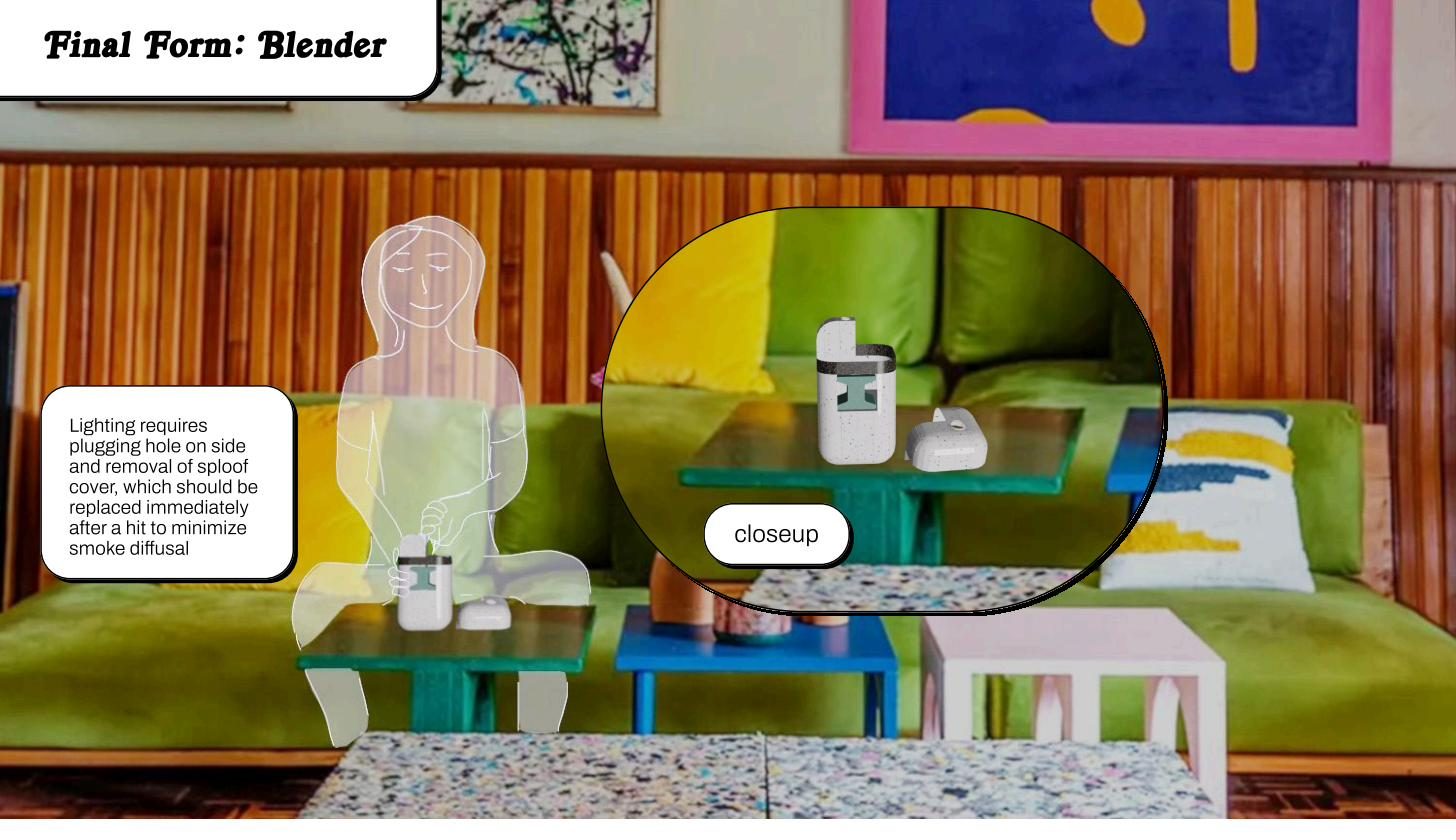
An end-to-end industrial design project where I let the research, not the mood board, pick the form. I ran a detailed user interview and an in-store observation visit to understand the product category and the rituals people build around it. Three themes kept coming back: process gratification (the experience of using the thing matters as much as the outcome), ease of maintenance, and temperature control.
Those three became the design criteria. Every stage after that, from problem framing through competitive analysis, ideation, and prototyping, got checked against them. When a concept looked good but did not answer a real need, I cut it. What survived is a physical prototype shaped by how people actually use these products rather than by how they photograph on a shelf.
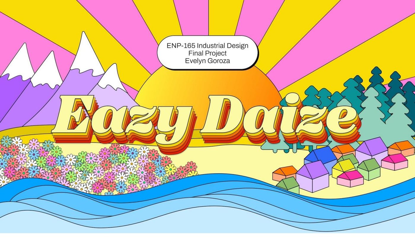
Preview only. Selected pages shown.
Consumer Psychology of Lululemon
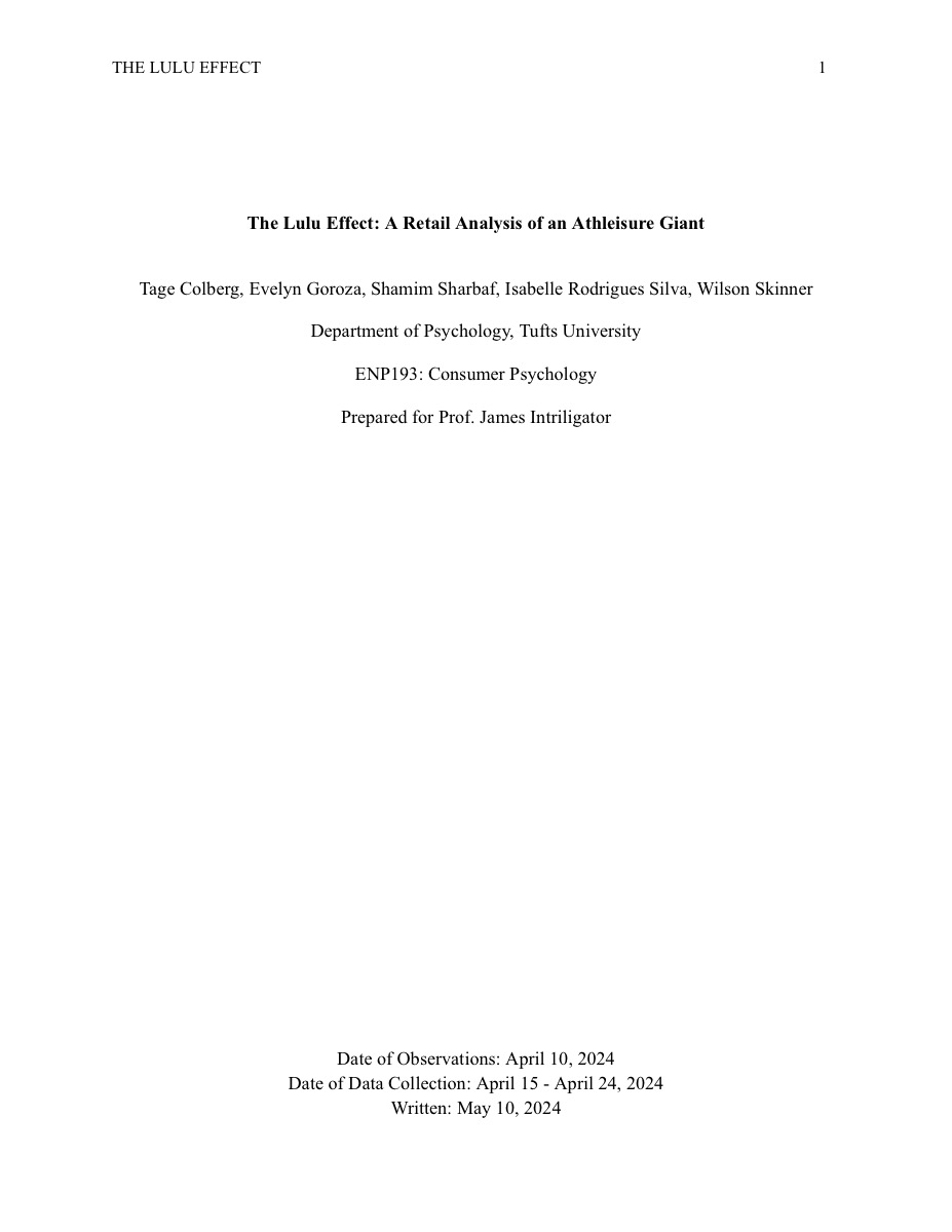
A research paper on how one brand turns retail space, workforce culture, and community into a psychological engine for loyalty. I looked at experiential store design, the sensory environment, the way brand identity is carried by staff rather than advertising, and how quality perception is manufactured, then at what all of that says about consumer behavior more generally.
If your team wants design decisions it can defend with data, I’d like to hear what you’re working on.
Click through for the full paper.